


Customers left covered in 'branding' after agency takes clients logo feedback literally to "Make it pop"
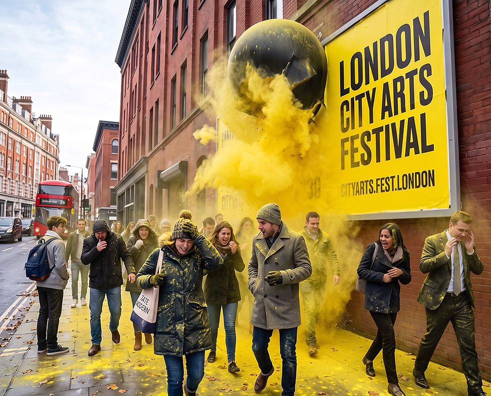
“It’s art, innit? We made it pop like Warhol and over everyone like Pollock”. Hundreds of London commuters have been left coated in bright yellow chalk powder after the creative agency behind the London City Arts Festival creative campaign interpreted its client's request to "make it pop” quite literally.
The festival's original identity lacked any real life until creative agency 3 Birds from Shoreditch updated the festival’s branding featuring a vibrant yellow colour palette, oversized typography and the tagline "Unleash Creativity."
While organisers praised the initial work for standing out across the city, they reportedly felt the campaign still lacked "that little bit extra."
According to meeting notes, for the second phase of the campaign one stakeholder then uttered the four words creative directors fear and junior designers obediently obey:
"Can we make it pop?"
Rather than adding a few abstract shapes or increasing the drop shadow by three percent, the agency developed a network of pressure-activated billboards that detected crowds before launching several litres of environmentally friendly yellow paint into the surrounding area.
"It definitely popped, yeah?” confirmed creative director Nick Turner. “Imagine if we actually used yellow paint like we had originally planned?“
Witnesses described scenes of confusion as office workers, tourists and an unfortunate wedding party emerged from nearby footpaths looking like they had wandered through a Keens mustard factory accident.
“To be honest we didn’t think they’d take our feedback this literally.” Said festival organisers, insisting that while this wasn’t what they expected, the activation perfectly embodied the campaign's promise to Unleash Creativity, describing the chalk dust-covered pedestrians as "unexpected brand ambassadors across the city.”
London Mayor Sadiq Khan criticised the stunt, calling it "an entirely inappropriate use of public space."
The 3 Birds creative director disagreed and backed themselves when no other agency would do the same after a bit of feedback like ‘make it pop’. “It’s art, innit? We made it pop like Warhol and over everyone like Pollock,” Turner explained.
Brand effectiveness researcher Sophie Williams, said the campaign had accidentally achieved every marketer's dream. "It generated extraordinary attention, exceptional mental availability and unprecedented earned media," she explained. "The only KPI it missed was basic assault."
Festival organisers confirmed they had asked the agency to "tone things down a little" for phase three of the campaign, prompting the creative team to begin prototyping a billboard that gently detonates yellow confetti cannons of small hands giving the old Churchill “up yours” two fingers and a paintbrush between them.
🗞️ For more branding, marketing, creative & business news with a distinctively satirical spin, subscribe to The Distinctive Times



Comments